
Visualizing Quality Score in Your Google Ads Accounts
When it comes to the world of Google Ads practitioners are always talking about “Increasing Quality Score” and what can they do to accomplish this… however, it’s often difficult to visualize the benefits.
Well here is an amazing visual that you can easily create in your Google Ads account (Kudos to Optidge‘s very own Rachael for spilling the beans ????
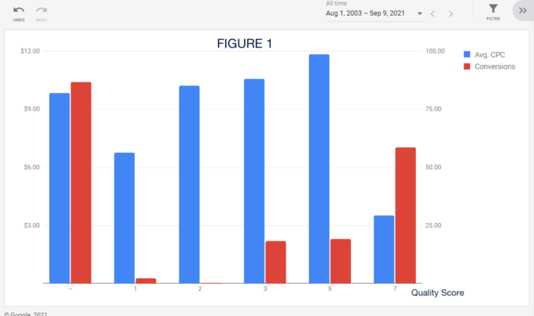
(Figure 1) This chart is comparing one of our client account’s quality scores (x-axis) to the avg. CPCs and Conversions. You’ll see that our avg. CPC gets significantly cheaper when we get higher than a 6 quality score. (Honestly, this is great, because sometimes there are accounts where you only hit the “jackpot” when you have 9/10s). You’ll also see that the higher the quality score, the more conversions this account receives! Although this could be considered basic PPC logic, it’s really cool to be able to visualize this and know what magic quality score number we need to hit to start saving!!!
(Figure 2) For this account, you can see that a QS of 5 is its sweet spot! Essentially, we don’t have to kill ourselves to get a QS any higher than that because we don’t get a deal.
Need help with your Google Ads contact us OR if you want to learn more about Google Ads (and other Digital Marketing topics) checkout ODEO Academy.